The art found in board games can often be an unsung hero of the game itself. Our brains drift to mechanics and strategy, but a truly great visual designer can transform a round of a game into a journey through the deep forest, or a quick jaunt through a Spanish villa. But that’s not always the case—the art can also horrify, shock and generally turn people away from the entire experience. And in some rare cases, recurring nightmares are preferable, visually. Here are some of the worst offenders and how they might fix things in the next release:
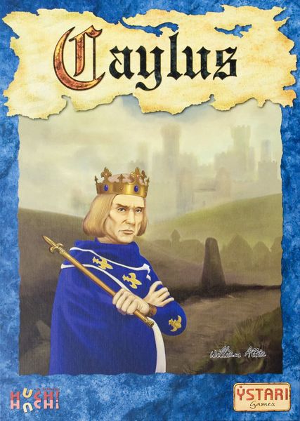
Caylus
Perhaps the greatest offense in this mundane portraiture is what’s not shown: a magnificent castle with ramparts galore, shrouded in fog; an idyllic town in the shadow of this castle, shrouded in fog; sleeves on the guy, shrouded in lack of visual perspective. Instead of what could have been a compelling story, we have a generic lad with a Beatles haircut looking at us with a disappointed glare—likely judging our decision to not only purchase Caylus but proudly display it.
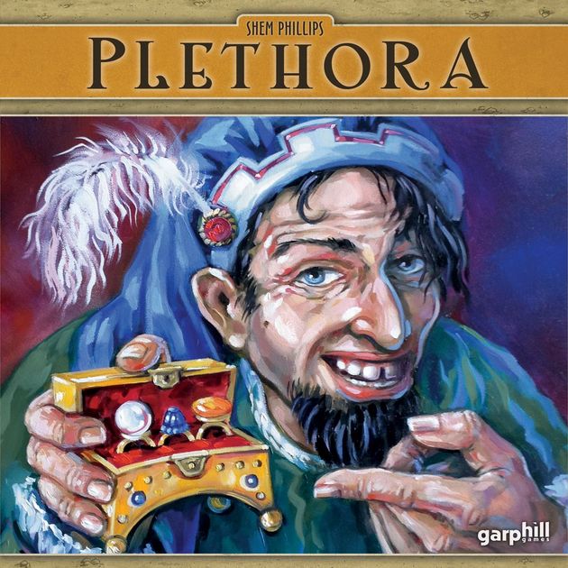
Plethora
It could be worse, of course. You could be glancing at the board game box art for Plethora, in which a Renaissance-era Paul Scheer tries to hawk some not-at-all-suspicious looking rings as if he’s selling stray organs out of a van. So many questions: Is that a pearl or a Jawbreaker? Where’s the guy’s neck and/or pinky finger? Why do the eyes track our every movement? He’s watching—oh boy, he’s watching…
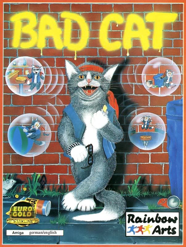
Bad Cat
To be clear: Nothing wrong with cat paintings, not by a long shot. In fact, we largely encourage board game manufacturers to tap into the feline well—our shelves could use some cat love to brighten the room. But there’s a lot going on in this artwork, including multiple types of illustration styles, various sizes of the cat itself based on contextual cues and a questionable degree of “bad.” If you do find yourself with a copy of the board game, cut out the box, stick it on the fridge and put a C+ on it—no one will ask any questions.
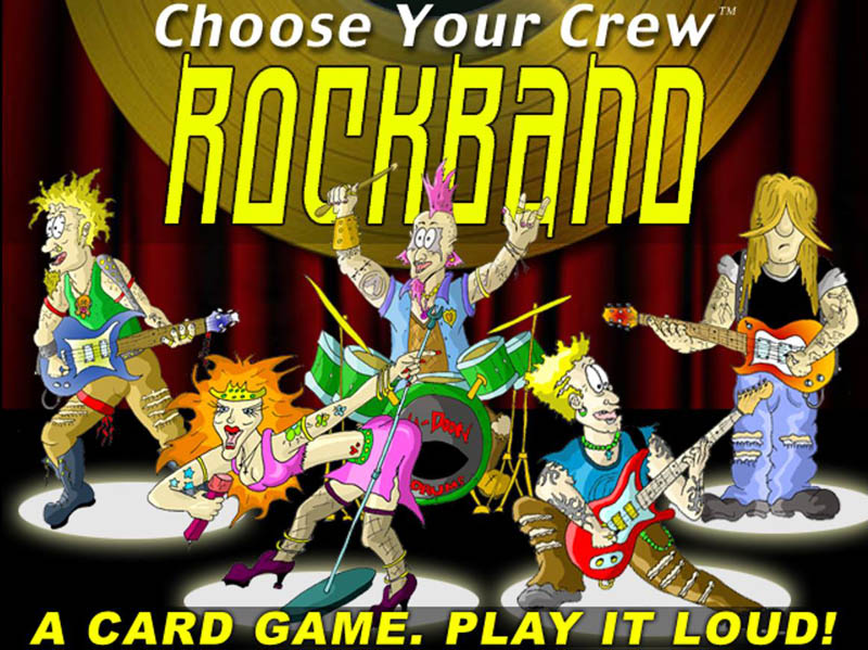
Choose Your Crew: Rockband
If the Rugrats grew up to embody the spirit of Beavis and Butthead, you’d partially capture the vibe of these wannabe rockers. In and of itself, the full illustration is not too bad (assuming you’re a fan of Ren and Stimpy-style sloppy art style) but that choice of accompanying font? We’ve seen pieces of Word Art more worthy of the Smithsonian!
What are some board games you’ve found with some questionable art, to say the least? Let us know in the comments!
